Fixing a table header on a horizontally scrolling table
Fixing a table header on a horizontally scrolling table
You would think this is easy. But it really isn't.
Chapter 0: The environment
This entire post is based on a React application, so while it's not mandatory, it would help if you had at least basic knowledge of React and React Hooks.
Chapter 1: The initial problem
In a project we've been recently working on we faced a very specific issue: the client wanted a large table.
What do I mean by large? Well, I've seen tables that have 15+ columns and are much wider than the screen. Luckily this was not one of those tables, but it was wider than the available space anyways.
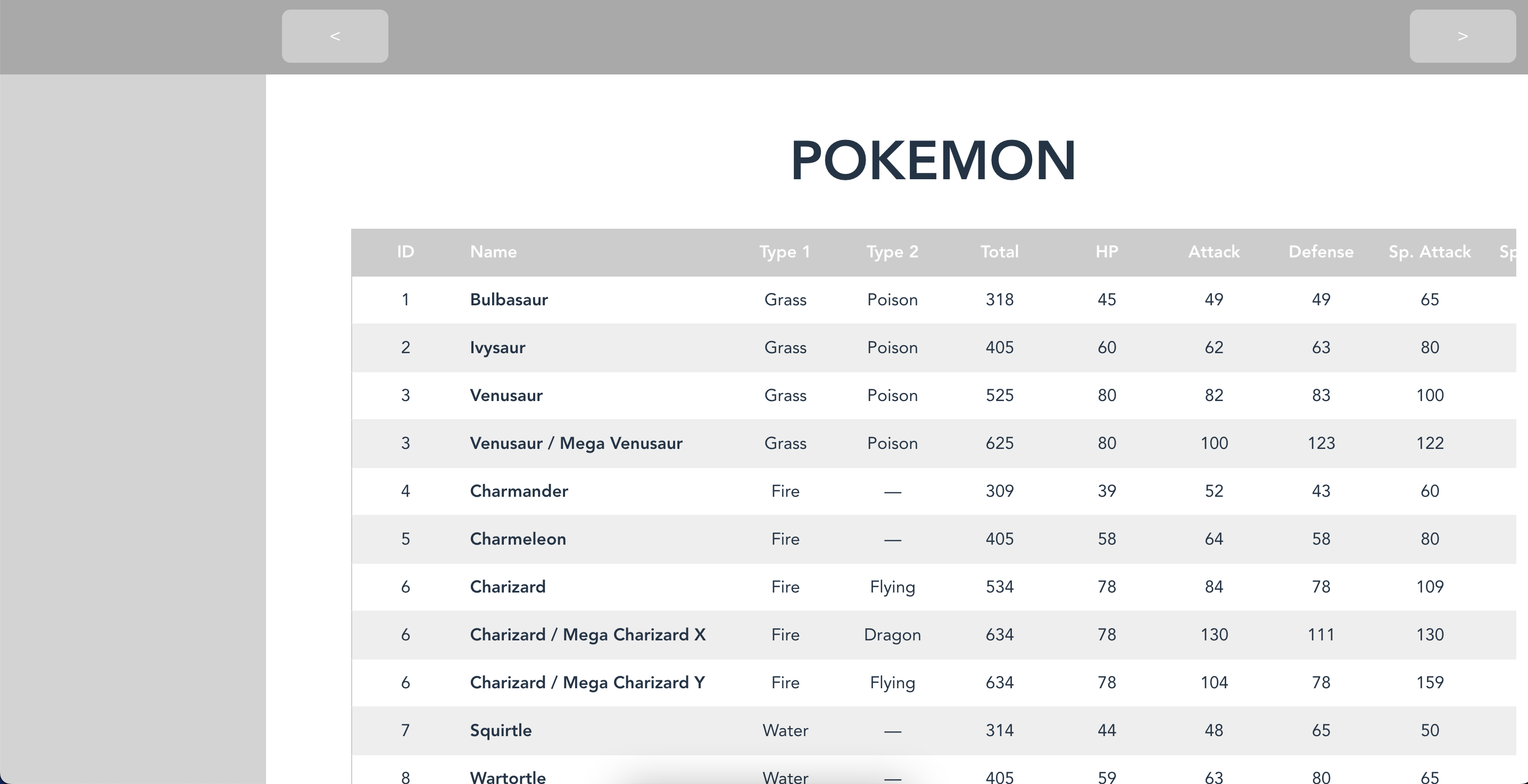
In addition to this, the table needed to have buttons to be easily scrollable.
In order to achieve this, we wrapped the table in a <div> that had its width locked to a specific value (something like 80% of the screen's width). We then added some buttons and a scrolling function that changes the scroll position of the wrapper. The scrolling function looked something like this:
This resulted in a nice table with the horizontal scroll and also buttons to scroll in case you don't have a touchpad.
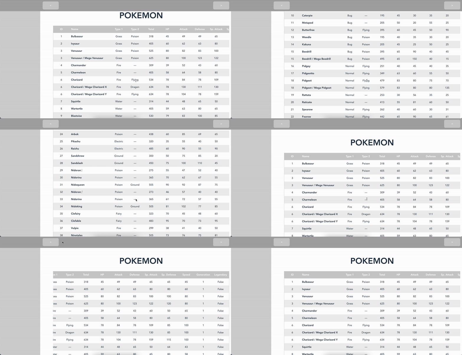
This was good, and working as expected.
Chapter 2: New requirements arise
The table in this state was approved and deployed to production. Everything was looking fine until some users started requesting that we leave the header fixed to the top when scrolling. That way they would be able to recognize what each value was without needing to scroll back and forth to check the column name.
Our first instinct was what I think most people would do: we added position: sticky to the thead element of the table.
This seems too easy to be true, right? That's because it is, please see what happens when we do this:
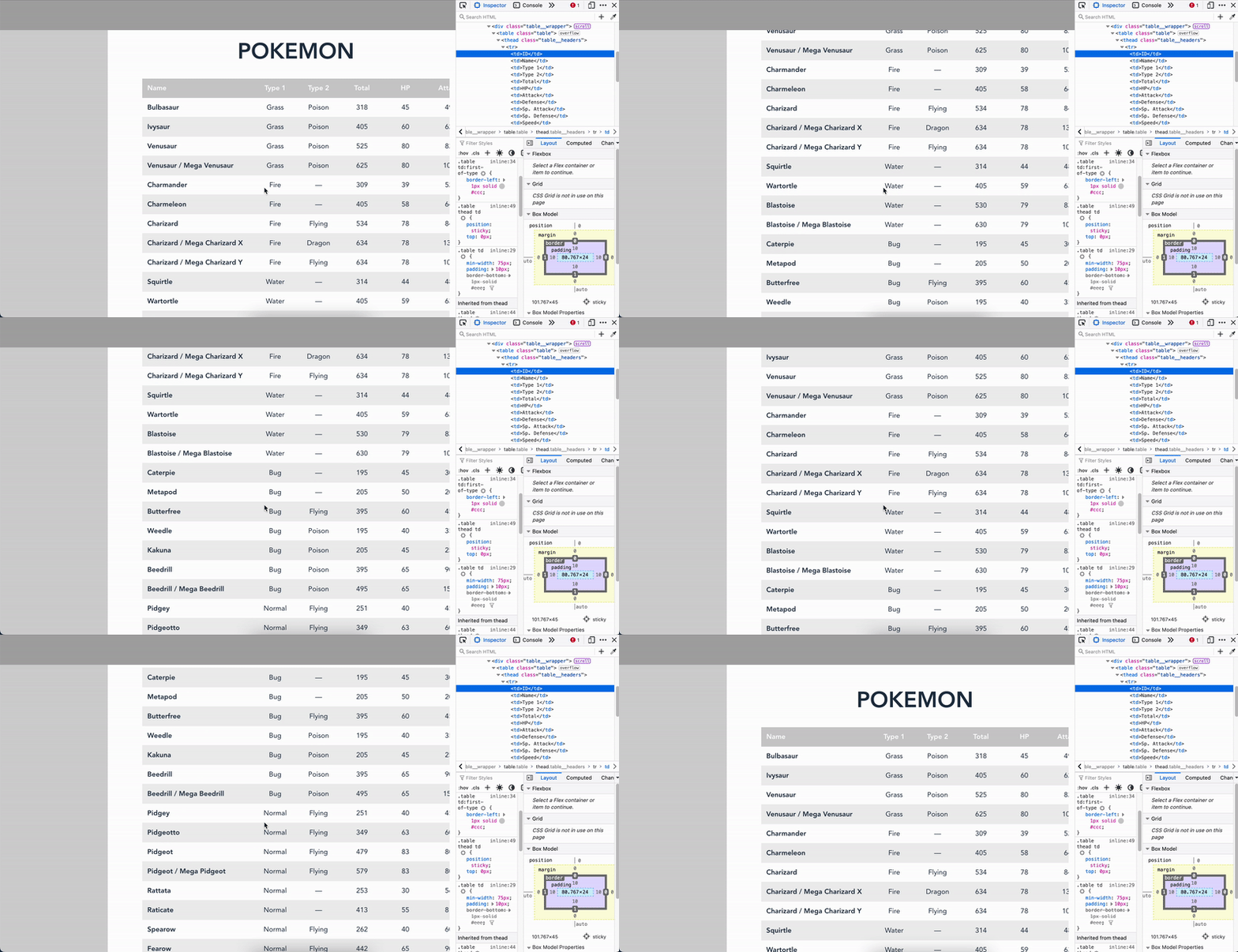
We can see that the table elements effectively have the position: sticky attribute, but after scrolling a bit they leave the screen.
This is because, as per CSS specifications:
This value always creates a new stacking context. Note that a sticky element "sticks" to its nearest ancestor that has a "scrolling mechanism" (created when overflow is hidden, scroll, auto, or overlay), even if that ancestor isn't the nearest actually scrolling ancestor.
So the problem here is:
.layout__contentis scrolling..table__wrapperis not scrolling..table theadis sticky relative to.table_wrapper.
What we wanted was .table thead to be sticky relative to .layout__content. This is not possible because even though .table__wrapper only has overflow-x specified it still has an overflow property, so the .table thead sticks to it instead.
Chapter 3: First approach.
So, taking the specifications into account, let's remove the overflow-x from .layout__content and see what happens.
What happens, then?
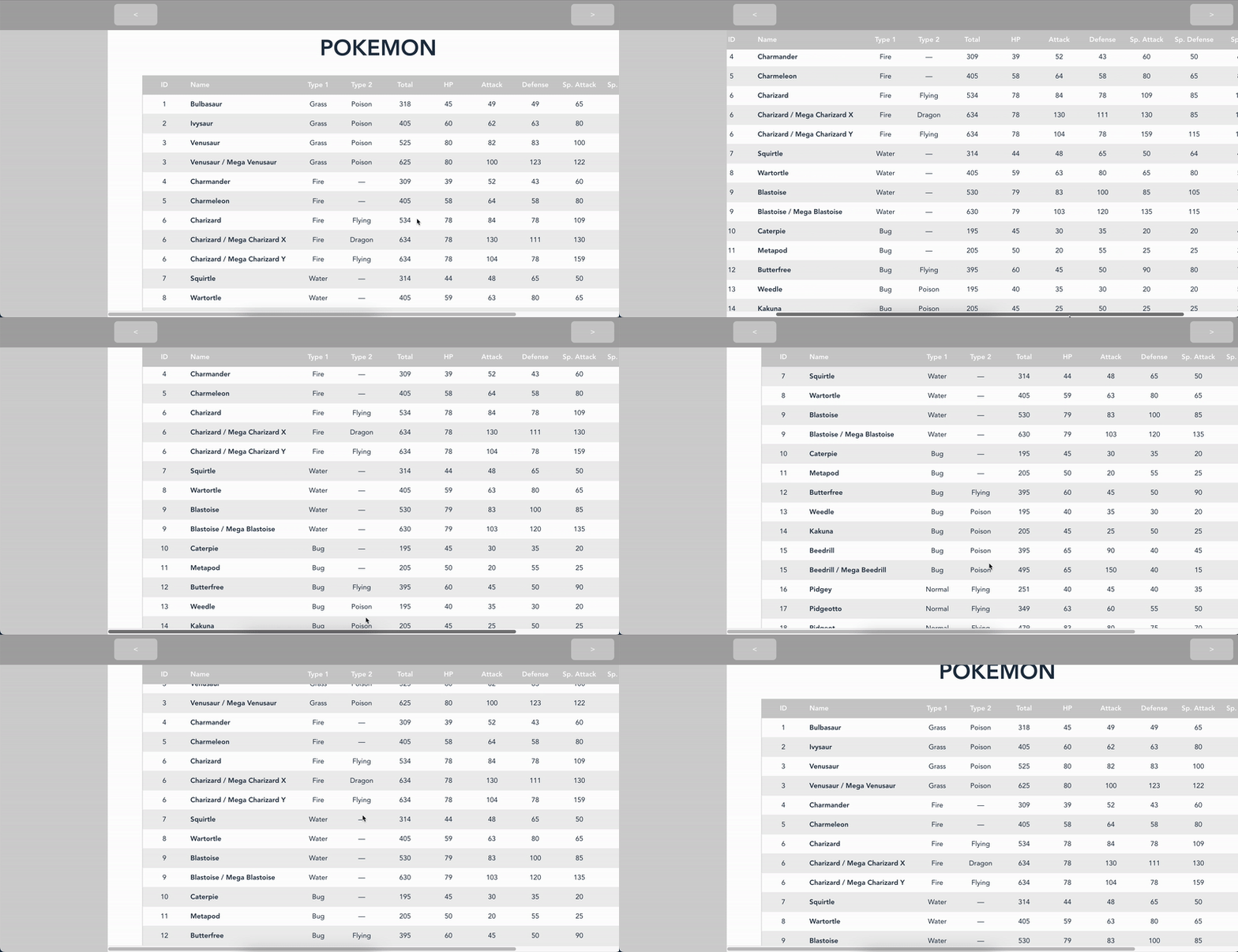
So, it looks like it worked... or did it?
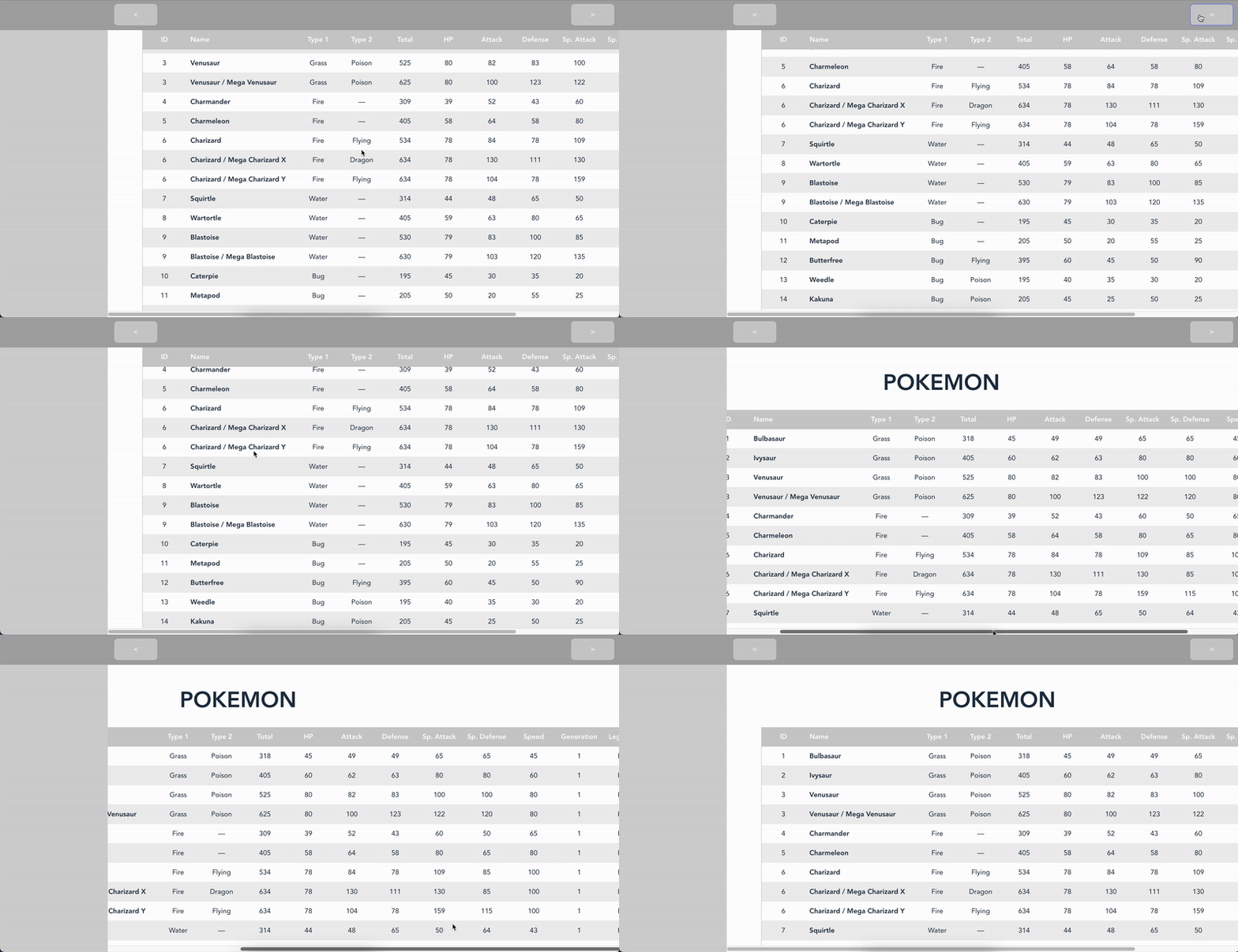
Oh, no! Our scroll buttons stopped working. Not only that, now scrolling the table scrolls the entire page, including the title. That was not supposed to happen.
But, hey! At least our headers are fixed now!
Chapter 4: Don't tell me what to do!
So after searching for solution (and scratching ours heads) for quite some time, we came up with a solution for the issue at hand: let's use JavaScript and CSS!
The basic idea is this:
- Let's see where the table header is.
- Let's see how far down the user has scrolled.
a. If the user has scrolled below the header start, let's
translatethetheadelement so it keeps at the top. b. If not, remove thetranslateproperty from the table header.
Since we were using React for this app, we made use of some refs to keep track of the actual DOM elements.
The code turned out to look something like this (I wrote it as a hook for reusability):
Let's break the code down:
Firstly, we declare two refs, one for the table wrapper and one for the table headers.
You may ask why we declare a ref for the table wrapper instead of the table itself. The reason behind this is that further down the code we use some positioning to calculate how much the user has scrolled, and the offsetTop is relative to the parent, so the table always has a offsetTop equal to zero relative to its parent (the wrapper). The wrapper is supposed to be a direct child of the scrolling element (in our case, the layout__content element).
We then write a useEffect hook that is in charge of adding an event listener to the scrolling element so that when it scrolls we act accordingly.
What do we mean by acting accordingly? Well, we should check the position of the header relative to the scrolling element, but as we will be moving it, we should check the table position instead, and that's where we use the table wrapper, as that element will not move around relative to the content element. From then on we can see if the parent element has scrolled past the header position, and if so, we translate that element by that scroll position difference (scroll position - header position). If the scroll position is above the header position we just remove that translate property.
It's also important to remember to remove that event listener, otherwise after navigating to another section of the app we could be referencing elements that are no longer there, and the app would crash. To accomplish this we return a function that does exactly that inside our useEffect.
So, did it work?
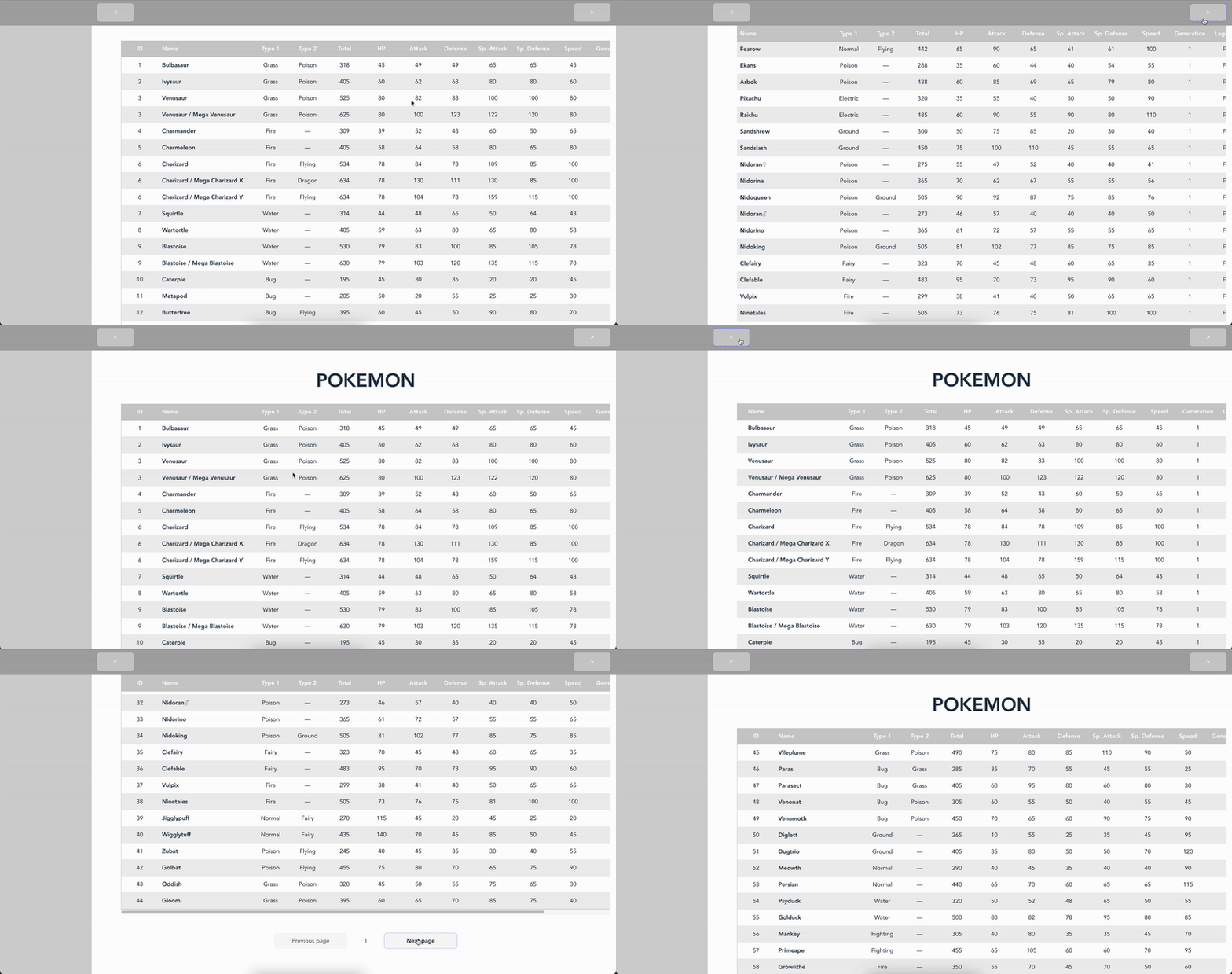
Yes! It's not 100% perfect, the header may jump a little bit but that's because of the event loop, but that's out of the scope of this blog post.
But there's something that pops up in the dev tools:

Following that link we see that Firefox recommends using position: sticky for what we are doing.
Well, Firefox, we'd use position: sticky if it worked like we wanted it to work.
Final thoughts
This problem was quite entertaining to work on, but I think that it'd be nice if the CSS specification could take this into account. Maybe a property called sticky-anchor with values "ancestor" | "screen" would be nice. I think ancestor would keep the current behavior (and be the default value) and screen would only take into account the whole screen. If that were the case we would be able to skip all that code and just have CSS like this: